
For decades, GNT has been the channel Brazilian women turn to when they want to unwind, to laugh, to learn something, to gossip a little. The brief for this rebrand didn't ask for a new channel. It asked for more of that: less TV about women, more TV for them.
The catch: GNT is live 24 hours a day, and their in-house team turns out new content every single day. So this wasn't really a design problem it was a systems problem. We needed to build something the team could run on their own, at broadcast speed, without it ever stopping looking like GNT.
GNT's audience doesn't just watch the channel, they have a relationship with it. Go too bold and the rebrand reads like a stranger wearing GNT's face. Play it too safe and nothing actually changes. The real work was finding the middle: an identity that still felt like GNT, just more like herself.
So we kept what already worked: the warmth, the ease, the feeling of an old friend, and gave it more confidence and rhythm. Something that could hold up on broadcast, on Instagram, and on a phone screen at 11pm on a Tuesday.

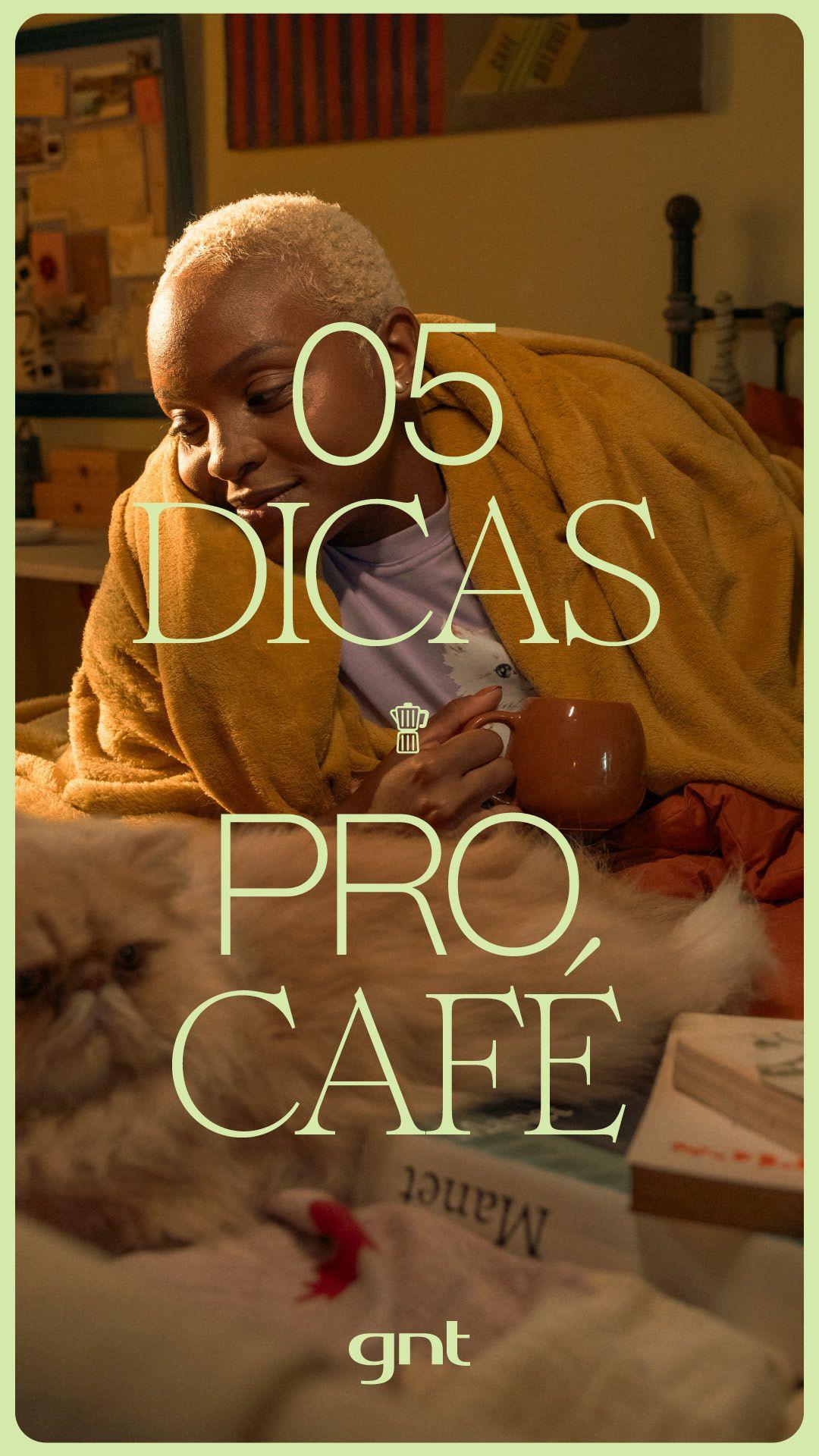
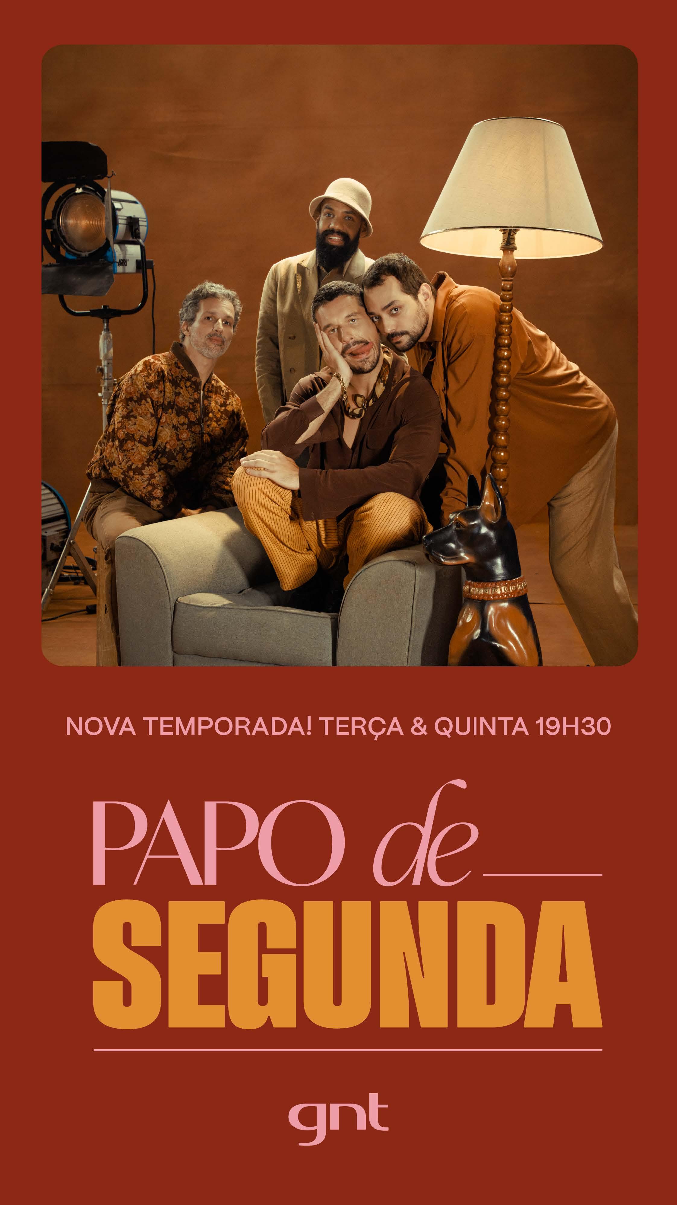

We didn't start with a logo. We started in the room with GNT's own team, building the visual language together instead of handing one down from a deck. From there, motion became the backbone of the whole identity — not decoration on top of the brand, but the way the brand actually talks.
Every piece, from the smallest on-screen bug to the biggest promo, moves to the same rhythm now. The result is a GNT that feels lighter, easier, less buttoned-up: somewhere you go to relax, not to be sold something.
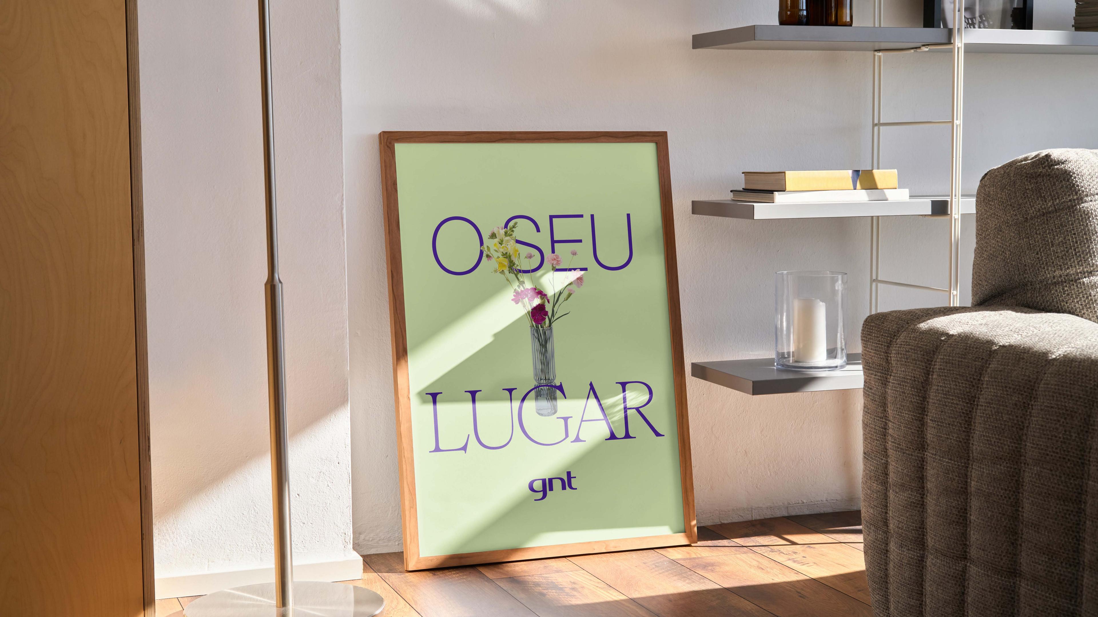
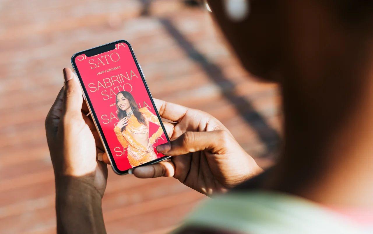
We built a modular logo animation architecture: a system where three objects animate across the G, N and T to tell infinite stories rooted in real women's lives. We documented 6 chamada formats, 7 endpage types, 5 programme bumper types, 5 grid systems, and over 60 distinct design templates. Then we packaged all of it into a 171-page brand book covering motion logic, production specs, and misuse rules.
A rebrand nobody can run without you isn't a system, it's a favour you keep doing forever. So we built custom After Effects automation for the whole on-air package and wrote every rule, and every exception, into one Brand Book. GNT's team now ships new work daily, on their own, and it still looks unmistakably like GNT.
Want to work with us? Get in touch at inquire@intermitente.co