The Challenge
GNT had defined a new brand vocation — to be the place for pleasure and relaxation for Brazilian women. The visual identity needed to match that ambition. But this wasn't a static brand refresh. GNT is on air 24 hours a day. Their internal team produces dozens of assets weekly, across TV broadcast, digital social, and out-of-home. The real challenge wasn't designing a new look — it was engineering a system that their team could use independently, consistently, and at the speed a live network demands.
The Vision
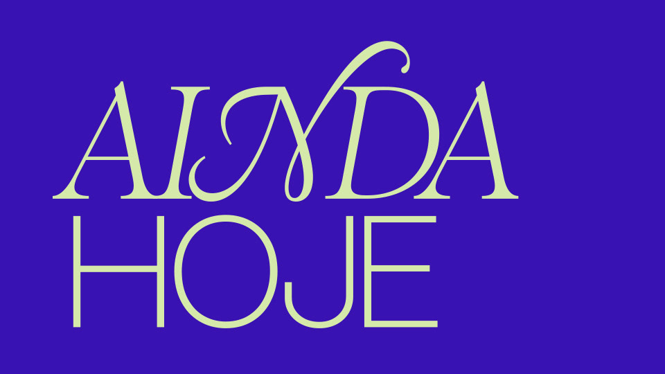
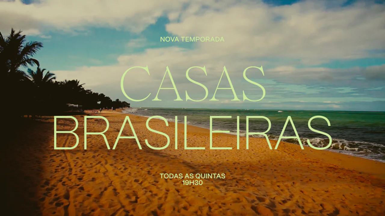
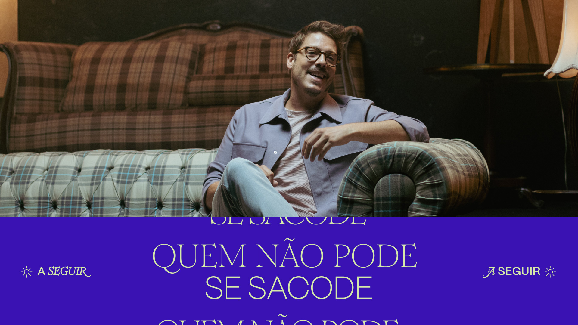
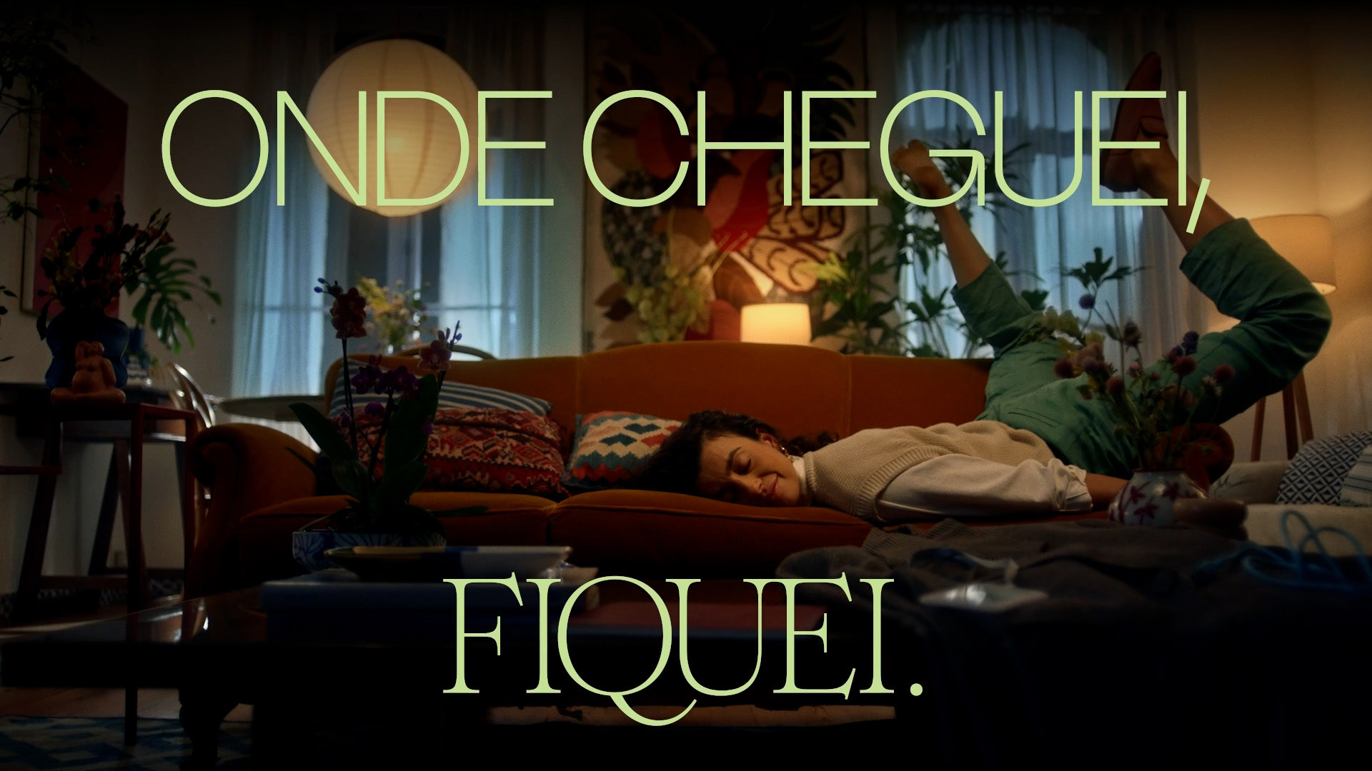
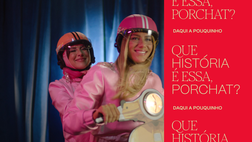
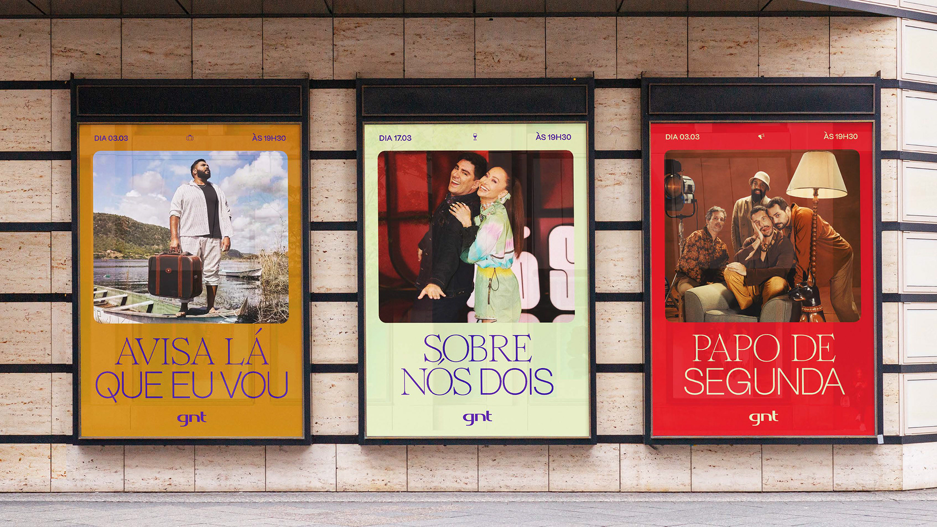
Our partnership began at the conceptual stage, where we joined forces with the in-house team to develop a cohesive design language reflecting the brand's multifaceted personality, shaping not just the aesthetics but the logic underneath them. We defined a dual-typeface system (PP Mori + Romie) with a 5-step typographic scale, specific tracking compensations, and alternation rules that give every piece of GNT communication its recognisable rhythm.
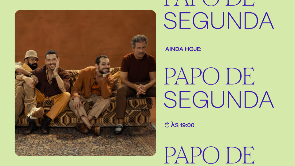
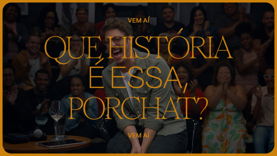
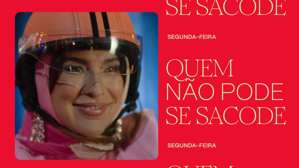
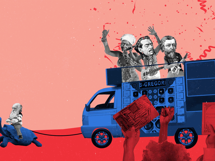
We built a modular logo animation architecture: a system where three objects animate across the G, N and T to tell infinite stories rooted in real women's lives. We documented 6 chamada formats, 7 endpage types, 5 programme bumper types, 5 grid systems, and over 60 distinct design templates.
Then we packaged all of it — motion logic, production specs, misuse rules — into a 171-page brand book.
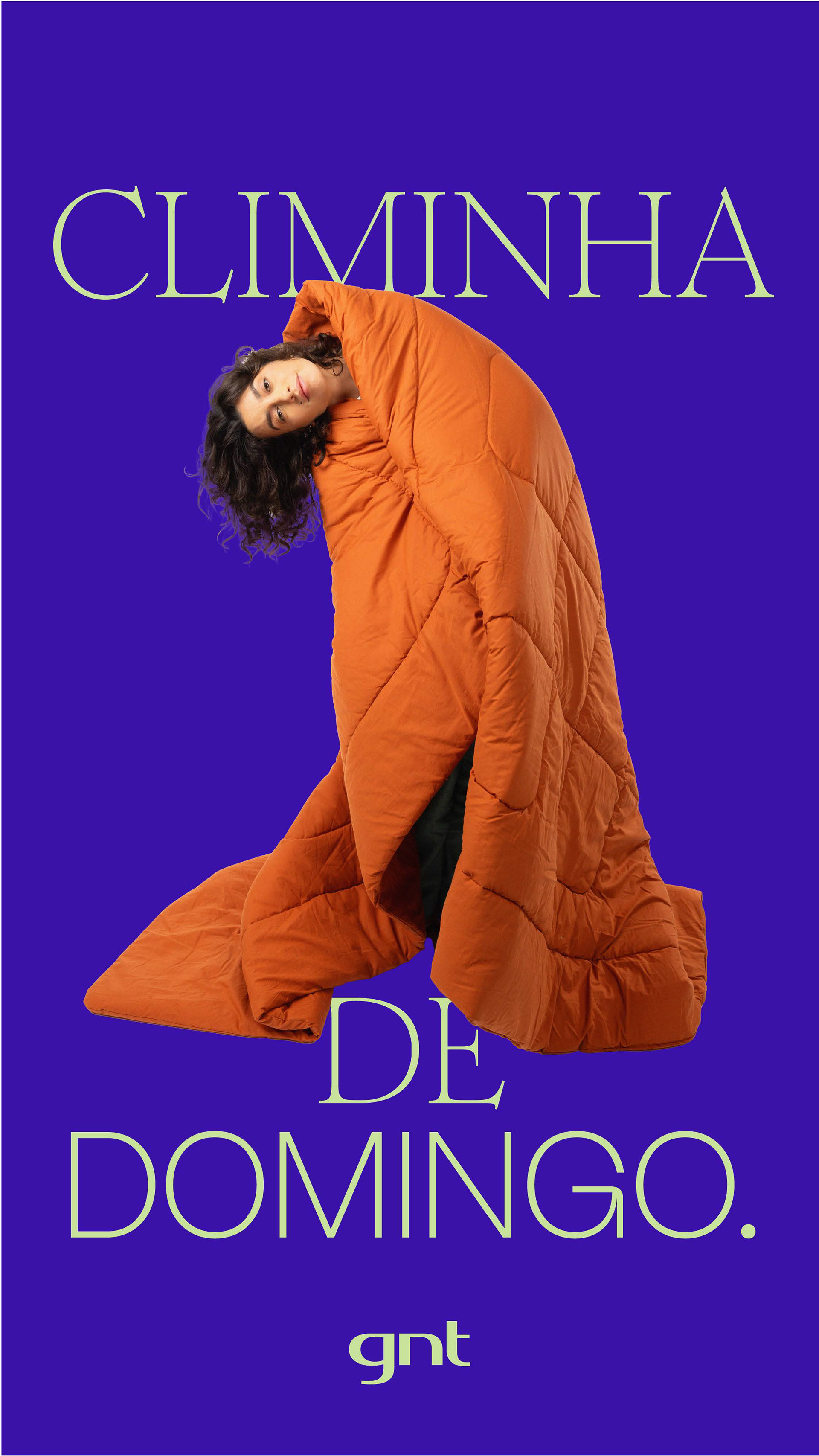
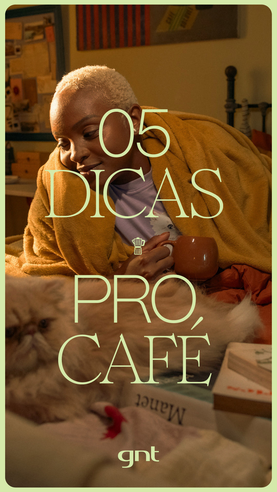
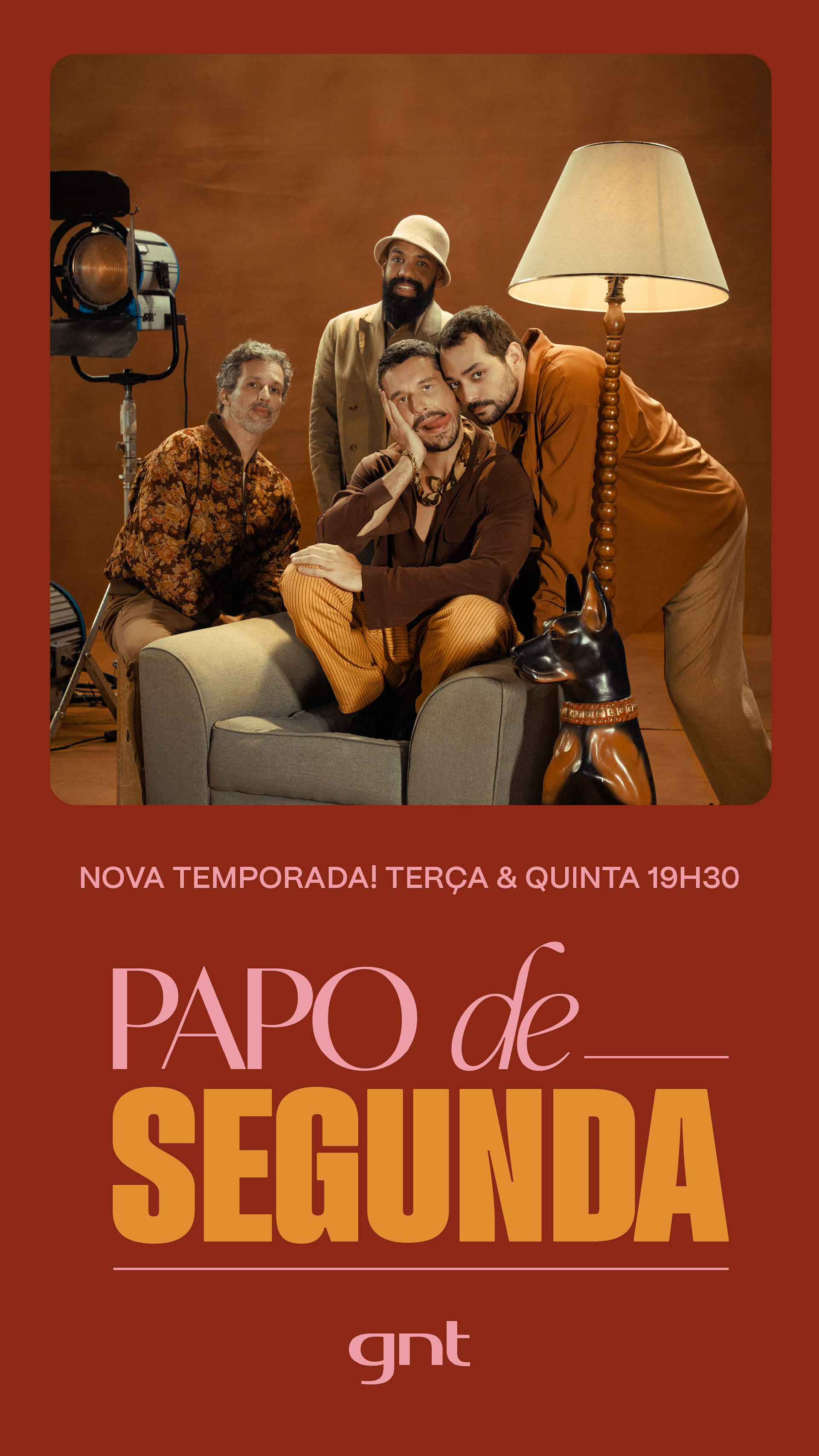
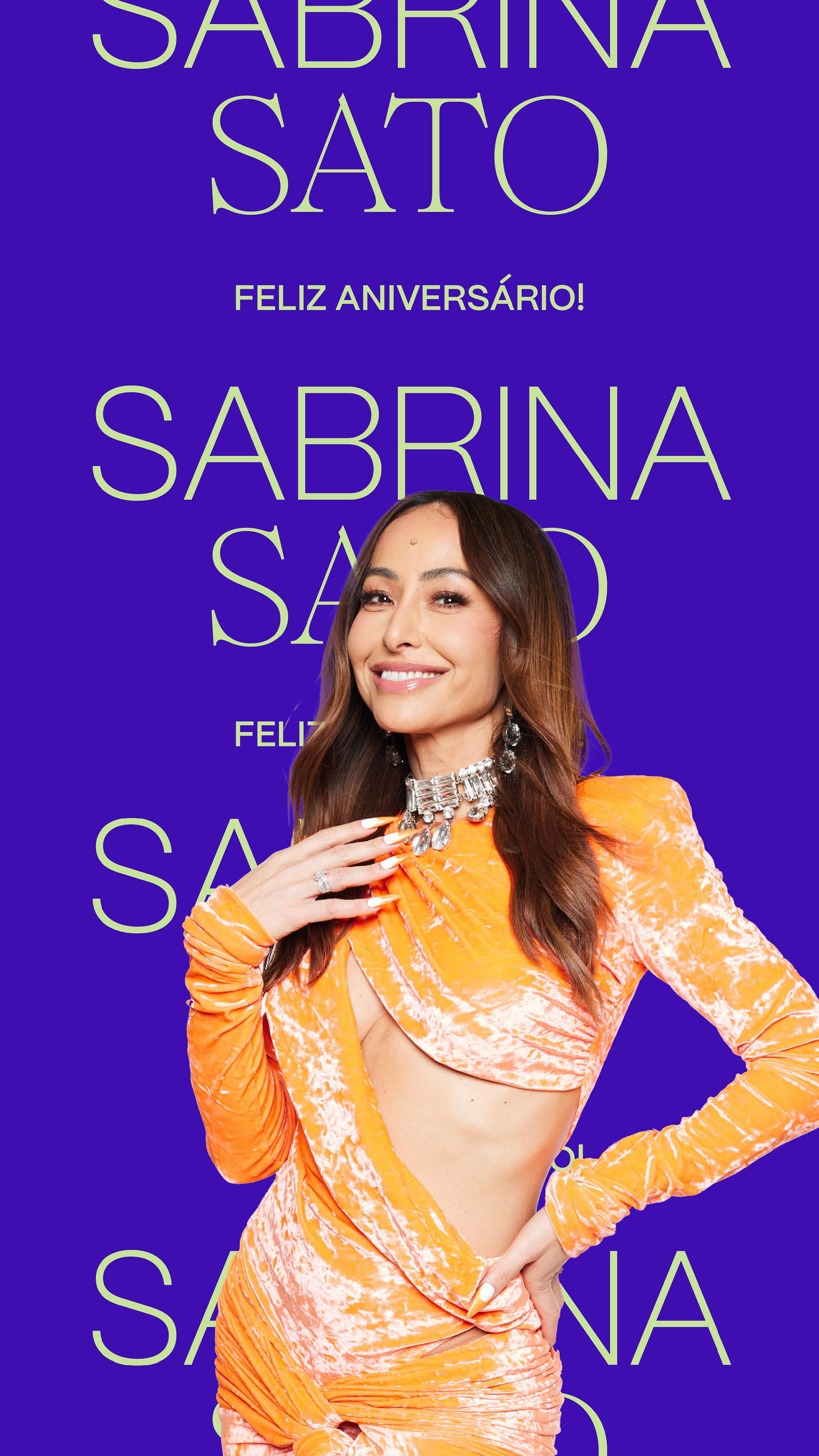
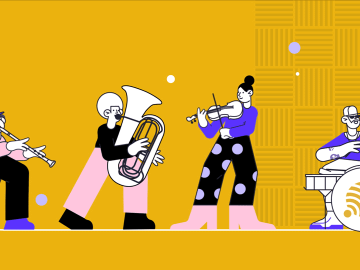
GNT is now lighter, more enjoyable, and uncomplicated. It's a space to share our struggles, reveal our vulnerabilities, and, whenever possible, laugh about it all. Or cry too, why not? A place to relax, let loose, chat away, and do whatever you like!
GNT. Your place.